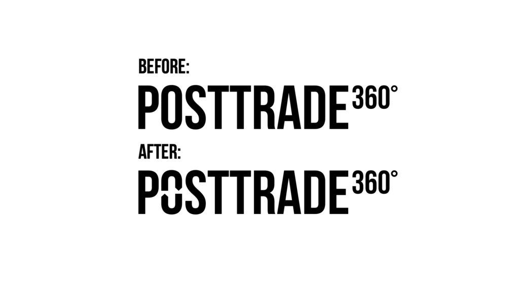
You will be excused if you find the change subtle, but the PostTrade 360° logotype has been boosted with a built-in delivery-versus-payment function. Or kind of.
“Our pure text logo has served us well since we got going with the marketing under the brand in 2018 and the product launches for conferences and news site in 2019. It reflects our preference for telling stories in a clear and straightforward manner, while not building unnecessary complexities to the way we operate. So there hasn’t actually been any graphical problem to fix” says Daniele Truini, managing director of Financial Media Group 360°, the holder of sister brands PostTrade 360° and Treasury 360°.

“Nevertheless, we felt a bit of an itch about two things. Firstly, it had no connection to the post-trade topic. Secondly, it didn’t reflect that little extra taste of joy and playfulness that we see it as our role to stimulate in the fundamentally serious and financial-system-critical professional niche that is post trade.”
The “o” in PostTrade has been transformed to two half-circle arrows, a common symbol of exchange or circulation. In the post-trade space, it naturally plays with the delivery-versus-payment logic that underpins so much of what it is all about, as well as the various two-way reconciliations that makes up a large part of the work day for thousands of operational professionals across the globe.
“The fact that we could solve both for the topical connection and the playfulness not by adding anything, but just by scratching off minor elements of the existing black print, just adds to that sense of creative fun,” adds Daniele Truini.
“On our commercial side, we hope it will signal to our clients how we are always ready to help them score on their communication objectives, with solutions that go straight on goal.”


